In 2020, COVID-19 surged, and so did the demand for therapists. The impact of the pandemic took a toll on many people. With many restrictions and precautions, people seeking treatment had to join longer waitlists, and they could not find available therapists or therapists who fit their needs and criteria.
Based on the research conducted by my team, we discovered that users run into two main issues: not finding availability or the right match for them. We alleviated these two issues by offering an app that is easy to navigate and assists users by narrowing down their options. Users fill up a questionnaire to tailor their search, and these tasks help them by displaying only therapists who accept new clients and match their needs.
Based on the research conducted by my team, we discovered that users run into two main issues: not finding availability or the right match for them. We alleviated these two issues by offering an app that is easy to navigate and assists users by narrowing down their options. Users fill up a questionnaire to tailor their search, and these tasks help them by displaying only therapists who accept new clients and match their needs.
Research
Quality and Quantitively Research
To better understand what is currently in the market, we collected imagery to learn key product features and functionality to support the user experience. Researched digital and non-digital experiences to inspire new opportunities for products and services and identified user expectations. Interviewed people to understand individual frustrations and interests. We researched Primary and secondary competitors to learn what's currently working and improved.
Learning from those first-hand experience
To better understand the matter, we interviewed 16 participants. The participants had some experience searching for a therapist or were in the process of finding one. The interviews lasted 30-45 minutes and were recorded to analyze their responses (meaningful quotes, goals, needs, pain points, thoughts, feelings, and actions). Then, as a group, we listed our observations for each interview to develop a priority matrix, user personas, and journey maps.
Giving a face to the problem
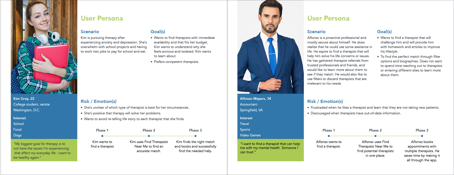
To help us define the audience, we created two user personas based on research results: Kim and Alfonso—both very different from each other. These personas helped us understand people's individual goals, frustrations, and journeys.
From this point, my journey continued without the rest of the team. The following assignments required each group member to continue on their own.
Weighing all results
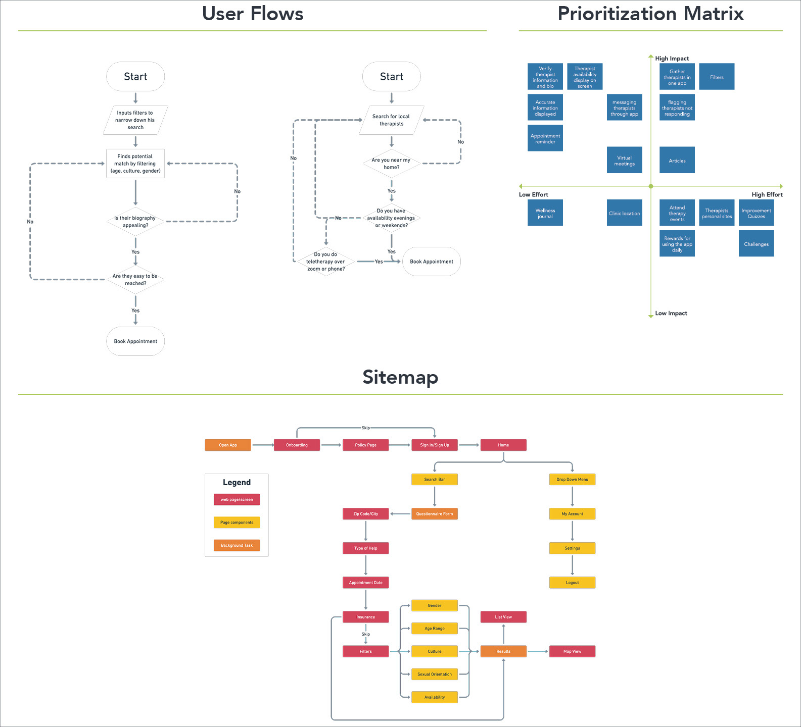
User Flows, Prioritization Matrix, and Structuring the Sitemap
The user flow was designed based on the two user personas. Each step in their journey provided me with a better understanding of how the users will achieve their goals. Through the Prioritization Matrix, we applied varied research techniques and experiences to quickly provide insight into weighing the different features and prioritizing decisions. The sitemap was structured to show how information should flow between pages and be intuitive to guide the user through the app.
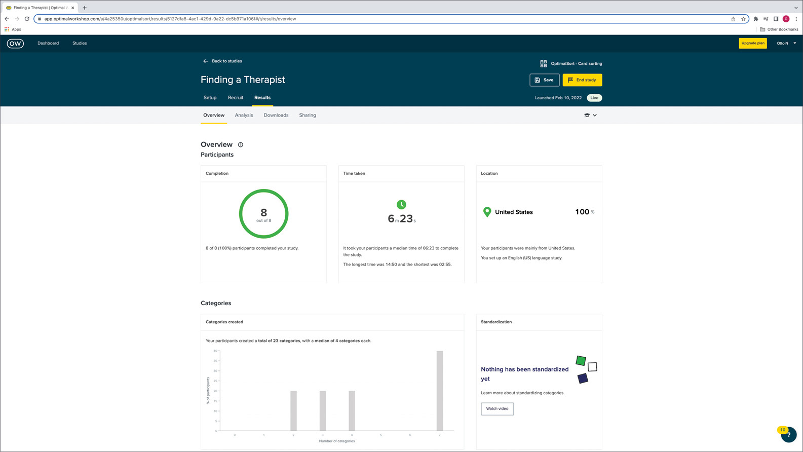
Card Sorting
Eight participants with different backgrounds, such as age, culture, and technology knowledge, were selected for this experiment. Their responses were valuable in validating the app's navigation and labeling and whether it was intuitive to the variant participants. The study was implemented using Optimal Workshop.
From the Pot to the Bowl
Based on all the discoveries in the different studies performed, I concluded that the app was going to focus on three pain points:
Filters: narrow their search by only focusing on relevant therapists that fit their needs.
Availability: Users will know which therapists take new patients on their selected dates without having to contact each therapist individually.
Timesaving: The app will gather all local therapists in the users' area. The results will be shown in "map view" to user proximity and "list view" to display high-rated therapists.
Sketch Concepts
I began visualizing different ideas to understand how the design would work. This part of the process was designed in conjunction with card sorting to iterate early design concepts and make any necessary changes.
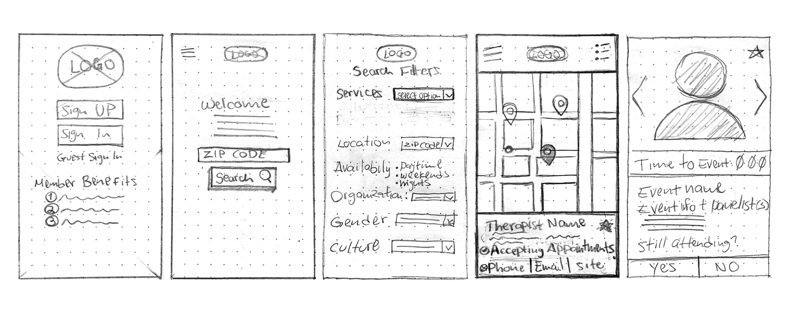
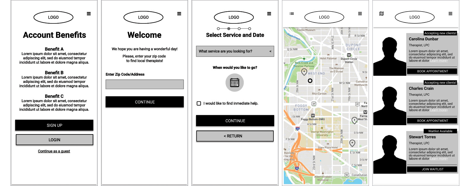
Low-Fidelity Wireframes and Prototype
Based on the sitemap, I began building interactive low-fidelity wireframes. The wireframes were designed with usability in mind. The goal was to create an easy-to-understand and navigate app, and I wanted to create an app with no distractions to complete the task effortlessly.
Prototyping—at this stage, the concept is ready to be tested. Did it meet its goal? Did the users understand how to use it? The answer was "yes." The concept was well-received. All participants were able to complete all tasks that were provided. One of my observations was that during task 6: "Select therapist closest to the user to display the therapist's name," one of the participants could not find the pointer that represented the user on the map. Another user struggled during 7: "Switch from 'MAP VIEW' to 'LIST VIEW' by selecting the icon at the top left." Ultimately, all participants completed the tasks at hand. My takeaways from this process were that I needed to clarify what icon represents the user and include a toggle button or something similar to show the user that the app has the option to switch between views.
Building the Brand
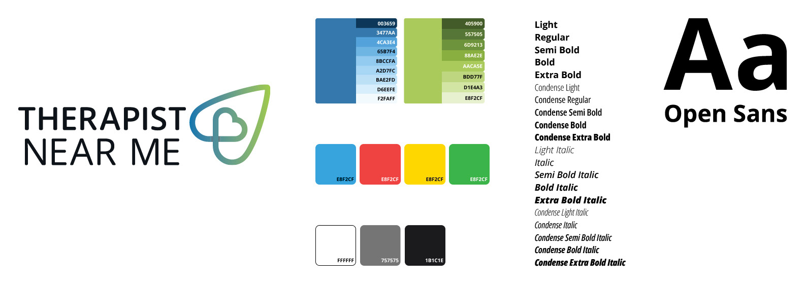
With the wireframes completed and the prototype well-received, it was time to start thinking about the visuals and how to keep the user engaged. I wanted the brand voice to be modern, vibrant, caring, and welcoming, and these needed to be reflected in the words, typography, imagery, and colors chosen.
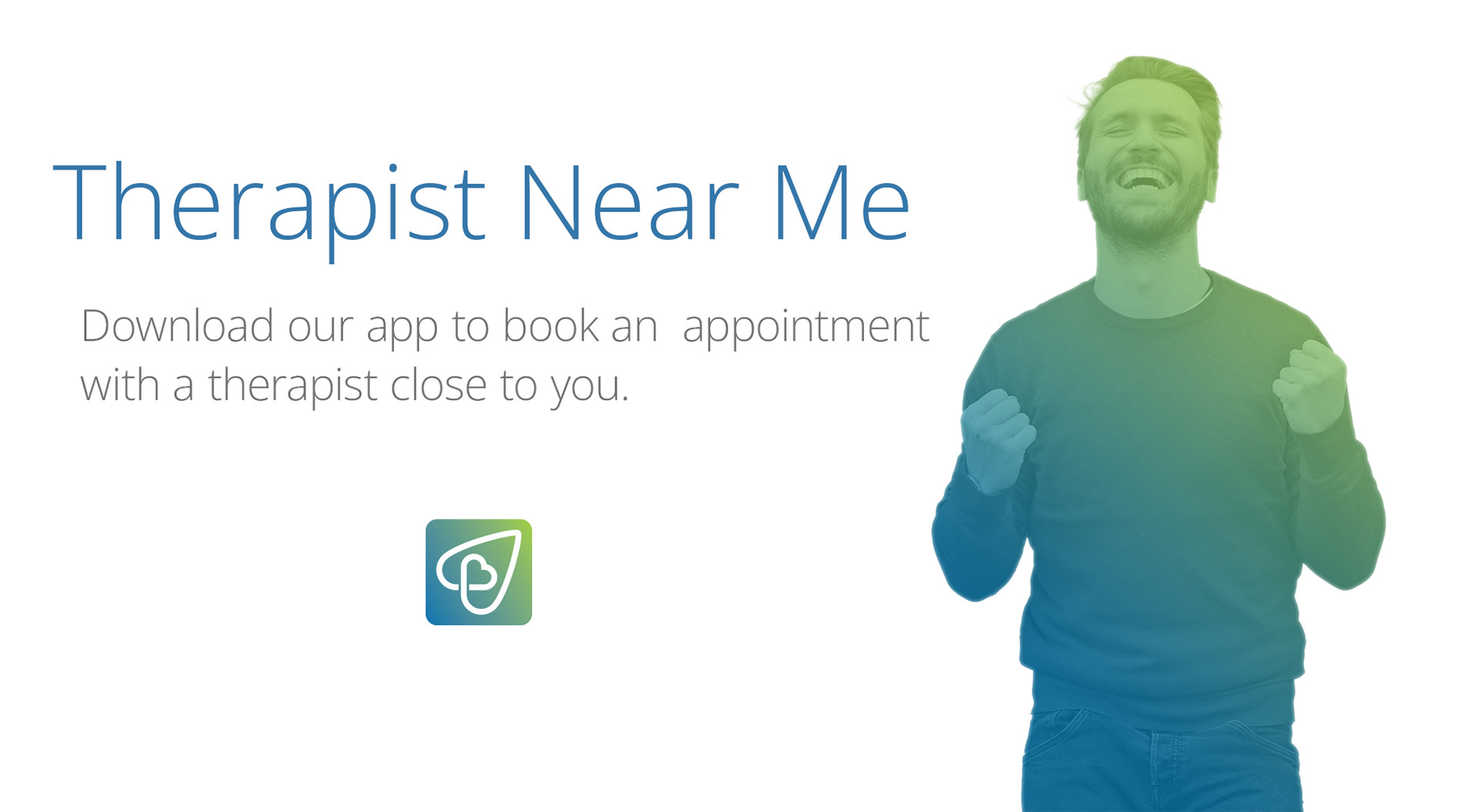
The name and logo
I named the app "Therapist Near Me" for visibility and the takeaway from using this app. I thought it clever to use "Near Me" for a good algorithm as many users in search engines always type "so and so… near me" when searching for a product or service. The logo mark is made from two hearts. One represents the therapist, and the small heart represents the user seeking help. Together, the two hearts show that the user is not alone. It is also shaped like a map pointer/user locator to show that it is part of a navigation system.
Typography and color usage
Open Sans was selected because of its different weights and modern design. Blue was chosen as the primary color because it symbolizes calm, peace, and trust. Green was chosen as the secondary color because it represents growth and harmony, and the two colors combined complement each other.
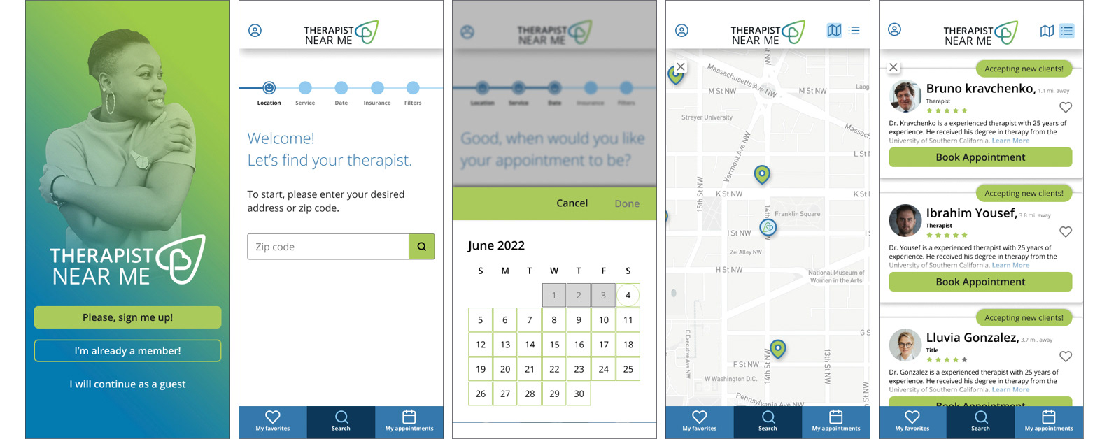
The final task: high-fidelity wireframes
These wireframes were designed in Figma, with most features being interactive. I established a clean and easy-to-navigate application using low-fidelity wireframes as the foundation. The hierarchy was easy to understand and follow. Based on feedback from the low-fidelity testing, the map iconography was better implemented by incorporating shadows into the interactive elements on the map. I also added a group of navigation buttons on the top-right side of the app to show that the user can switch between two different views. To view the prototype, click here.
Try out the prototype yourself!